---
title: "Canvas"
description: "Draw rectangles, text and icons."
---

Use `Canvas` for boards, diagrams and other layouts with fixed coordinates.

## Example

<div className="pattern-example">
<div>

```tsx app/index.tsx
import { useState } from "react";
import { Canvas, CanvasText, Rectangle, Screen, Stack } from "ink";

export default function Example() {
  const [selected, setSelected] = useState(0);
  const cells = [0, 1, 2, 3];
  const bounds = (id: number) => ({
    x: 1 + id % 2 * 110, y: 1 + Math.floor(id / 2) * 110,
    width: 110, height: 110,
  });

  return <Screen title="Canvas">
    <Stack align="center">
      <Canvas width={222} height={222}>
        {cells.map(id => <Rectangle key={id} {...bounds(id)}
          fill={id % 3 === 0 ? "#242424" : "#333333"}
          onPress={() => setSelected(id)} />)}
        <Rectangle {...bounds(selected)} stroke="#DDDDDD" strokeWidth={2} />
        {cells.map(id => <CanvasText key={id} {...bounds(id)}>{id + 1}</CanvasText>)}
      </Canvas>
    </Stack>
  </Screen>;
}
```

</div>
<div className="pattern-preview">
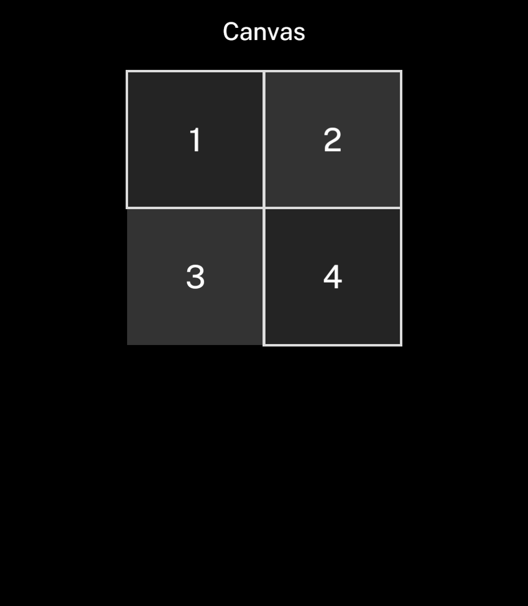
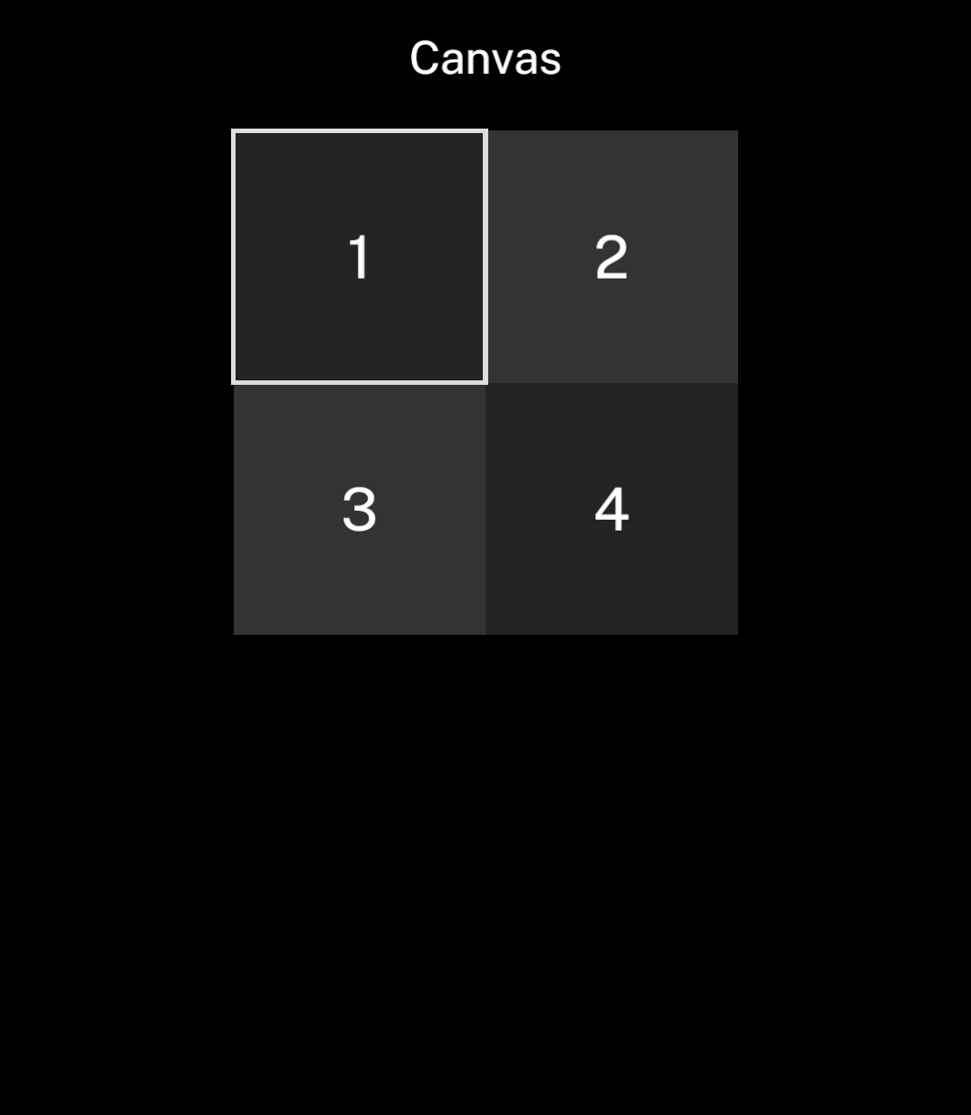
<img src="/images/patterns/canvas.png" alt="Four numbered squares with the first square selected." width="1080" height="1240" />
</div>
</div>

## Coordinates and outlines

Coordinates use Ink’s logical units, starting at the canvas’s top-left corner. The canvas scales down proportionally if it cannot fit. Drawing is clipped to its edges.

`Rectangle` accepts a fill, a stroke or both. Strokes sit centred on the rectangle’s boundary. Leave half the stroke width inside the canvas edge to keep the full outline visible.

```tsx
import { Canvas, Rectangle } from "ink";

<Canvas width={202} height={102}>
  <Rectangle x={1} y={1} width={100} height={100} fill="#242424" />
  <Rectangle x={101} y={1} width={100} height={100} fill="#333333" />
  <Rectangle x={101} y={1} width={100} height={100}
    stroke="#DDDDDD" strokeWidth={2} />
</Canvas>
```

Colours use `#RRGGBB` values and follow the app’s colour scheme. Rectangles are drawn in order; text appears above them. Add `onPress` to a rectangle to make its area tappable.

## Long press and drag

<div className="pattern-example">
<div>

Add `onLongPress` to a tappable rectangle for a second action. With `onDragEnter`, holding and dragging calls the handler on each rectangle crossed in the same canvas. Releasing ends the drag without firing `onPress`.

```tsx
<Rectangle x={0} y={0} width={40} height={40}
  fill="#242424"
  onPress={() => select(0)}
  onLongPress={() => beginSelection(0)}
  onDragEnter={() => extendSelection(0)} />
```

</div>
<div className="pattern-preview">
<img src="/images/patterns/canvas-drag.png" alt="Cells 1, 2 and 4 selected after holding and dragging across the canvas." width="1080" height="1240" />
</div>
</div>

## Text

`CanvasText` centres a single line within its bounds. Set `align` to `start` or `end` for horizontal alignment. Text outside its bounds is clipped.

Use `tabularNumbers` for equal-width digits in counters, timers and grids.

```tsx
import { Canvas, CanvasText } from "ink";
<Canvas width={200} height={60}>
  <CanvasText x={0} y={0} width={200} height={60}
    size={26} colour="#BBBBBB" align="start">12</CanvasText>
</Canvas>
```

Canvas accepts `Rectangle`, `CanvasText` and `CanvasIcon` children. Use `Stack` and `Text` for layouts that need wrapping or automatic spacing.

## Icons

`CanvasIcon` accepts the same icons as `Icon`. Set `colour` to contrast with a filled rectangle.

```tsx
import { Canvas, CanvasIcon, Rectangle } from "ink";
import { editSquare } from "ink/icons";

<Canvas width={40} height={40}>
  <Rectangle x={0} y={0} width={40} height={40} fill="#FFFFFF" />
  <CanvasIcon x={6} y={6} size={28} name={editSquare} colour="#000000" />
</Canvas>
```