---
title: "Lists"
description: "Display scrolling collections."
---

## Example

<div className="pattern-example">
<div>

```tsx app/index.tsx
import { List, Screen, Text } from "ink";

const items = Array.from({ length: 20 }, (_, index) => ({
  id: String(index),
  name: "Item " + (index + 1),
}));

export default function Items() {
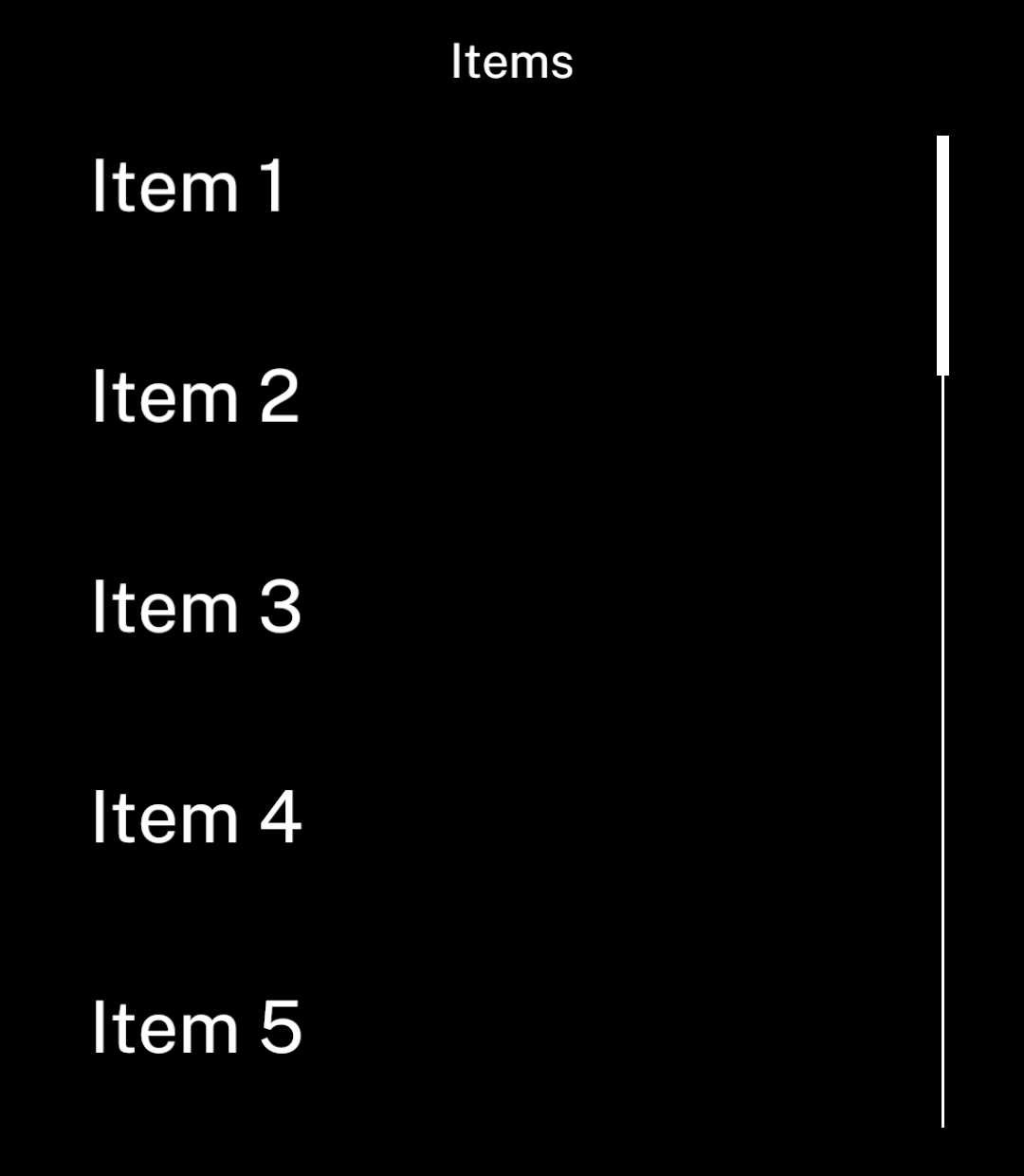
  return <Screen title="Items">
    <List
      items={items}
      keyExtractor={item => item.id}
      renderItem={item => <Text>{item.name}</Text>}
    />
  </Screen>;
}
```
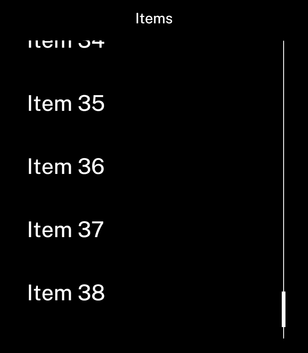
<p>Rows are virtualised and measured automatically. Give each item a unique, stable key.</p>

</div>
<div className="pattern-preview">
<img src="/images/patterns/list.png" alt="A list of numbered items with a scrollbar." width="1080" height="1240" />
</div>
</div>

## Scrolling

<div className="pattern-example">
<div>

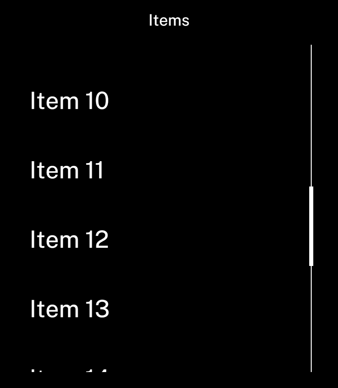
<p>The scrollbar appears when items overflow.</p>

</div>
<div className="pattern-preview">
<img src="/images/patterns/list-scrolled.png" alt="Later items visible after scrolling." width="1080" height="1240" />
</div>
</div>

## Spacing

<div className="pattern-example">
<div>

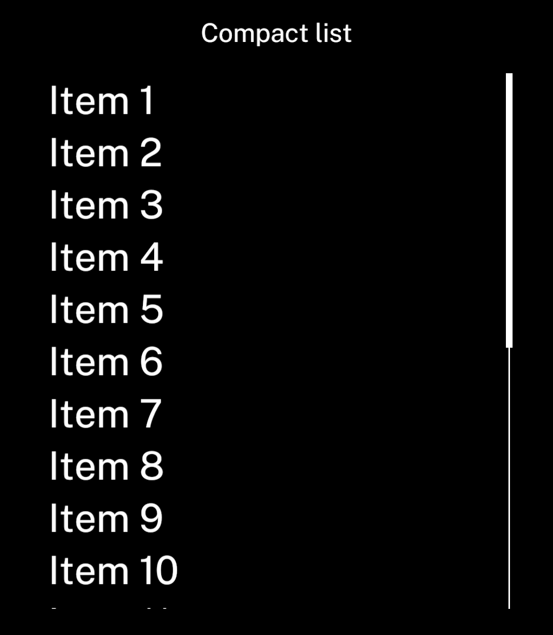
<p>Lists use the same spacing as screens. Set <code>gap={0}</code> for compact rows.</p>

```tsx
<List items={items} gap={0}
  keyExtractor={item => item.id}
  renderItem={item => <Text>{item.name}</Text>} />
```

</div>
<div className="pattern-preview">
<img src="/images/patterns/list-compact.png" alt="A list with no gaps between rows." width="1080" height="1240" />
</div>
</div>

## Pagination

<div className="pattern-example">
<div>

<p><code>onLoadMore</code> runs when roughly one screenful remains before the bottom. Append the returned items and set <code>hasMore</code> to false after the last page.</p>

```tsx
<List
  items={items}
  keyExtractor={item => item.id}
  renderItem={item => <Text>{item.name}</Text>}
  onLoadMore={loadNextPage}
  hasMore={hasMore}
/>
```
<p><code>loadNextPage</code> must return a promise. Set <code>hasMore</code> explicitly: it defaults to false, so a callback alone does not start pagination. Ink allows one request at a time and shows a retry action if it fails.</p>

</div>
<div className="pattern-preview">
**Start**

<img src="/images/patterns/list-pagination.png" alt="The start of a paginated list." width="1080" height="1240" />

**More items**

<img src="/images/patterns/list-pagination-more.png" alt="Additional rows loaded automatically while scrolling." width="1080" height="1240" />

</div>
</div>

## Follow new items

<div className="pattern-example">
<div>

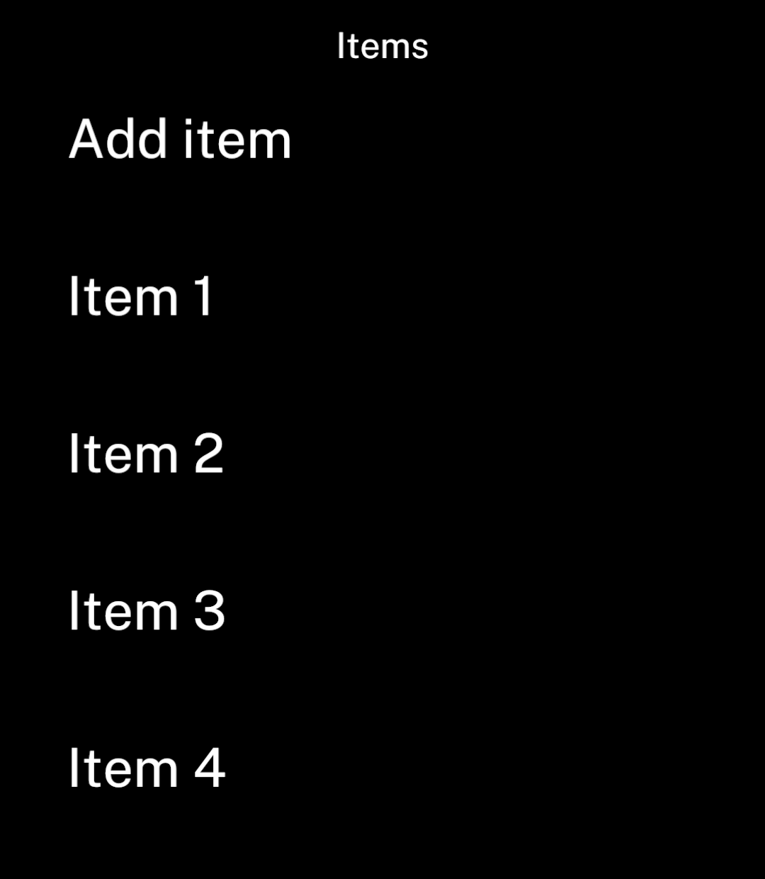
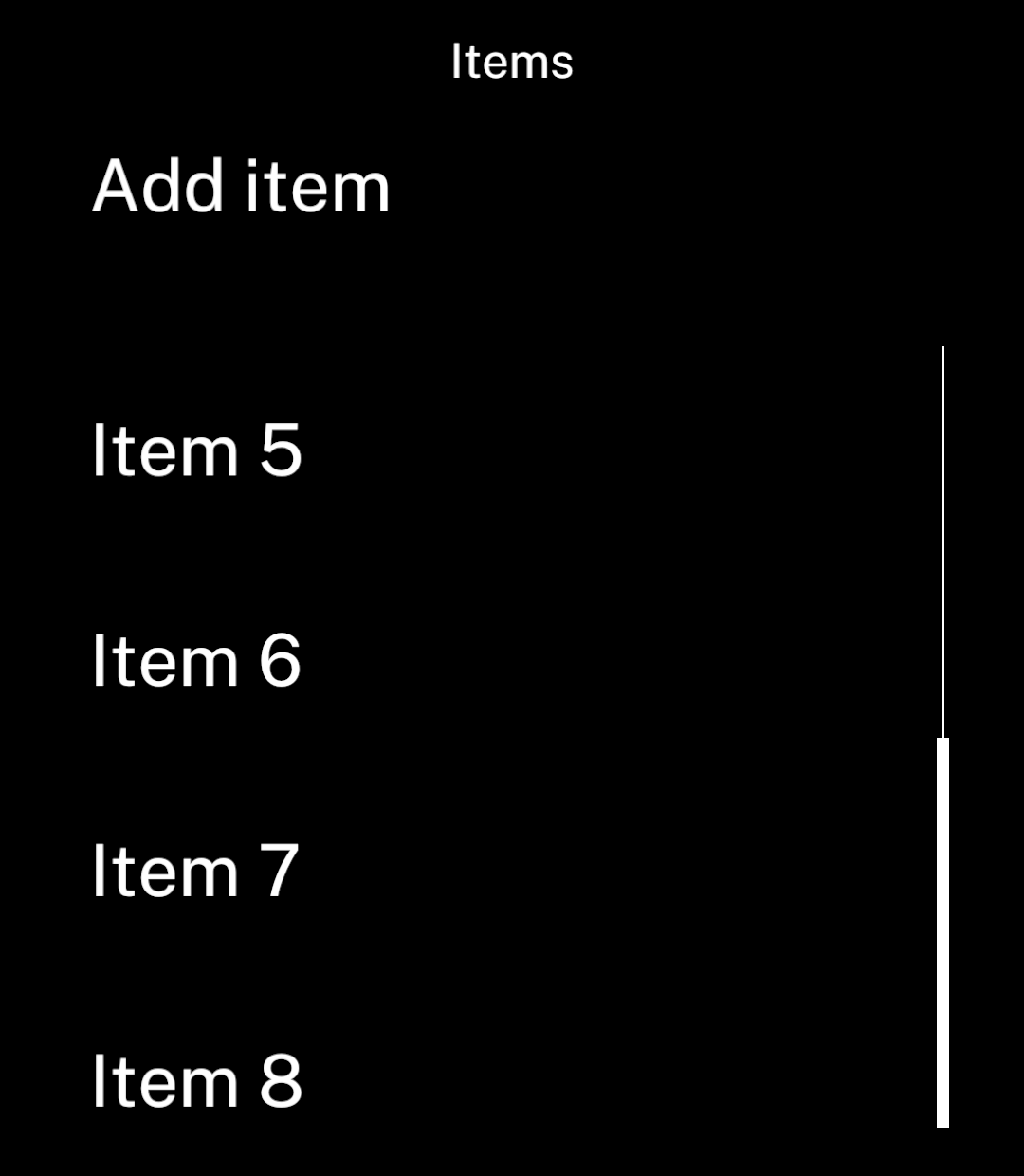
<p><code>followEnd</code> follows additions while the reader is near the bottom. It pauses while they read earlier items.</p>

```tsx
<List items={items} followEnd
  keyExtractor={item => item.id}
  renderItem={item => <Text>{item.name}</Text>} />
```

</div>
<div className="pattern-preview">
**Before**

<img src="/images/patterns/list-follow.png" alt="Four items below an anchored Add item button." width="1080" height="1240" />

**After**

<img src="/images/patterns/list-follow-after.png" alt="The latest added item visible at the bottom." width="1080" height="1240" />

</div>
</div>

## Updating items

Replace arrays and changed items instead of mutating them. Rows outside the visible window unmount, so keep lasting state in the parent or a store. Ink preserves the visible position when earlier rows load or change height.

Use `onLoadOlder` and `hasOlder` to prepend history. Both `hasMore` and `hasOlder` default to false; set the matching flag to true when a page is available. [Conversations](/conversations) handle this for chats.

Set `initialPosition="end"` to mount the last rows and scroll their containing `Screen` to the bottom when the list mounts. The default is `"start"`. This also works when the list appears after loading. Changing the prop later does not move the reader; use a new React `key` to start a different list. Use `followEnd` separately to follow subsequent additions.

Use `measurementKey` when a setting changes row layout without changing the items. Give the list a new React `key` when changing its data source. Keys and content versions have a combined 128 KiB limit; keep keys short and loaded history bounded.