---
title: "Inputs"
description: "Text entry with the device’s keyboard."
---

## Example

<div className="pattern-example">
<div>

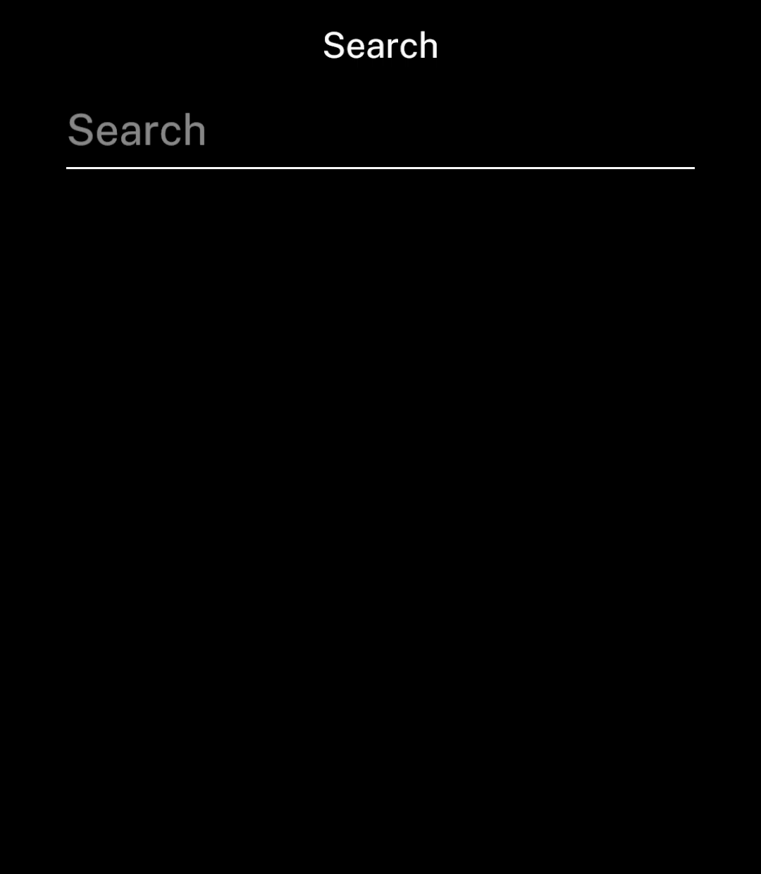
<p>Place inputs on their own page, with hints or errors underneath.</p>

```tsx app/index.tsx
import { useState } from "react";
import { Screen, TextInput } from "ink";

export default function Search() {
  const [query, setQuery] = useState("");

  return <Screen title="Search">
    <TextInput
      value={query}
      onChange={setQuery}
      placeholder="Search"
      action="search"
    />
  </Screen>;
}
```

</div>
<div className="pattern-preview">
**Empty**

<img src="/images/patterns/input-empty.png" alt="Search input with its placeholder." width="1080" height="1240" />

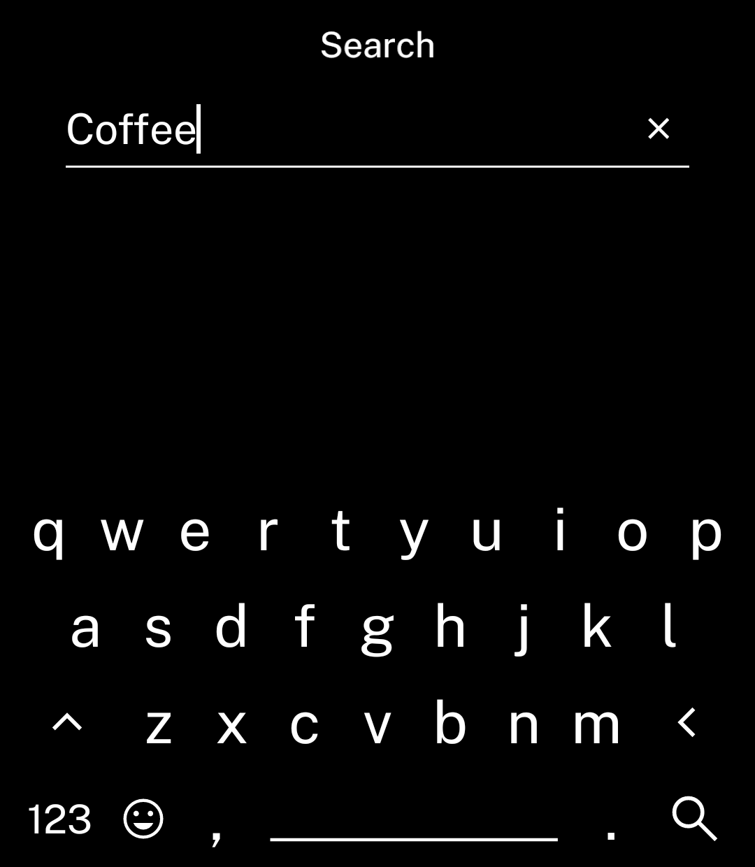
**Typing**

<img src="/images/patterns/input-typing.png" alt="Search input with text and the keyboard open." width="1080" height="1240" />

</div>
</div>

## Keyboard action

<div className="pattern-example">
<div>

<p><code>action</code> requests a <code>"search"</code> or <code>"done"</code> key. Its appearance depends on the selected keyboard.</p>

<p>Both call <code>onSubmit</code> with the entered text. Without it, they dismiss the keyboard.</p>

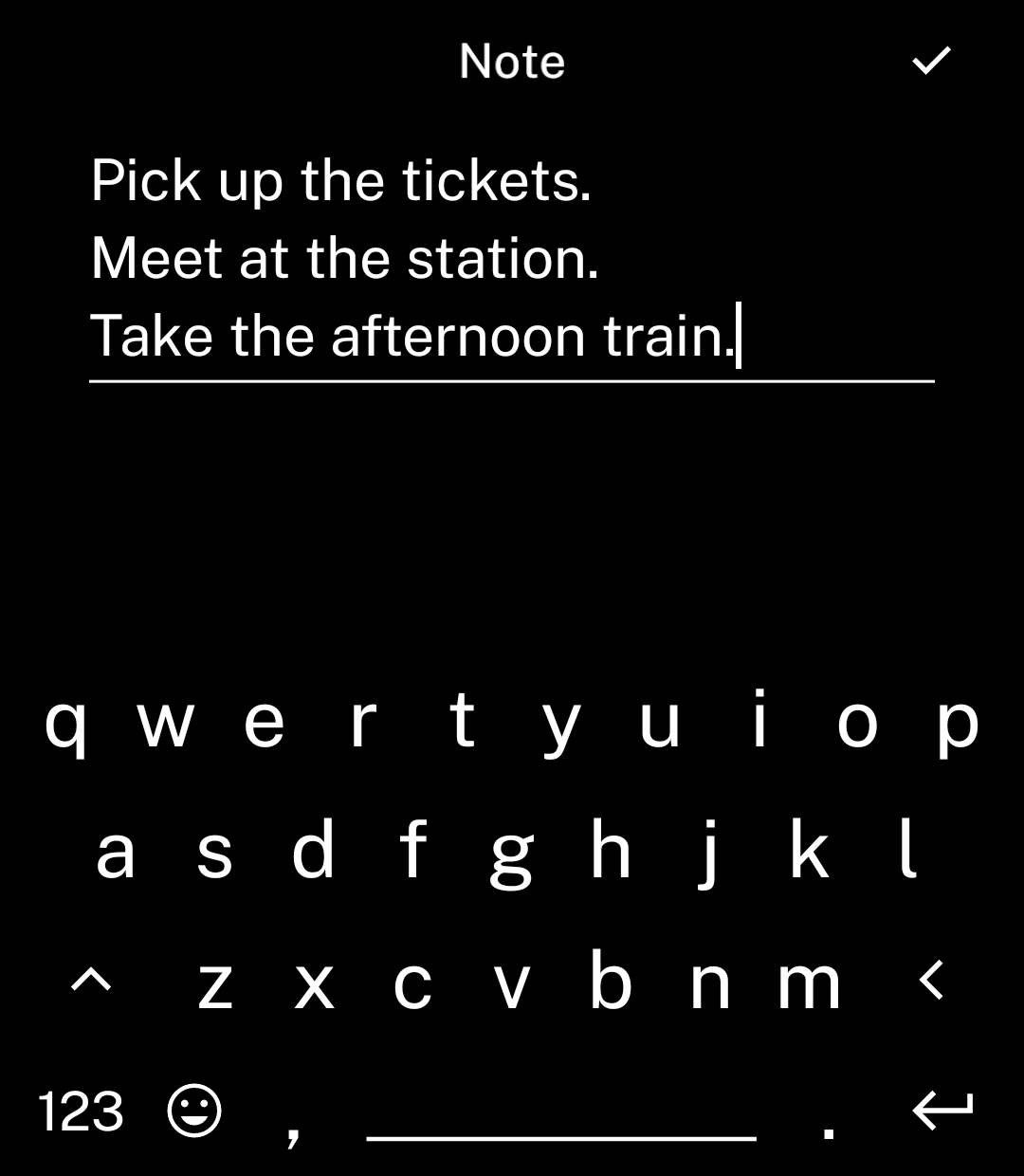
<p>Use <code>action="return"</code> for new lines. Add a header <code>rightAction</code> to save or continue. The input grows to three lines, then scrolls.</p>

```tsx
import { check } from "ink/icons";

<Screen
  title="Note"
  rightAction={{ icon: check, onPress: () => save(note) }}
>
  <TextInput
    value={note}
    onChange={setNote}
    placeholder="Write a note"
    action="return"
  />
</Screen>
```

<p><code>save</code> is your function to save the text and leave the page.</p>

</div>
<div className="pattern-preview">
**Search**

<img src="/images/patterns/input-typing.png" alt="Keyboard with a magnifying glass as the Search key at the bottom right." width="1080" height="1240" />

**Done**

<img src="/images/patterns/input-done.png" alt="Keyboard with a tick as the Done key at the bottom right." width="1080" height="1240" />

**Return**

<img src="/images/patterns/input-multiline.png" alt="A multiline note with a tick in the header and Return on the keyboard." width="1080" height="1240" />

</div>
</div>

## Numbers

<div className="pattern-example">
<div>

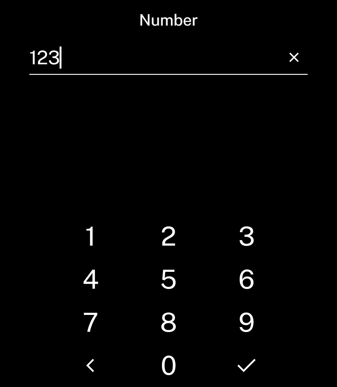
<p>Use <code>inputMode="numeric"</code> for digits only. The value remains a string.</p>

```tsx
<TextInput
  value={value}
  onChange={setValue}
  placeholder="Enter a number"
  inputMode="numeric"
  action="done"
/>
```

</div>
<div className="pattern-preview">
<img src="/images/patterns/input-numeric.png" alt="Number input with the numpad open." width="1080" height="1240" />
</div>
</div>

## Prefix and suffix

<div className="pattern-example">
<div>

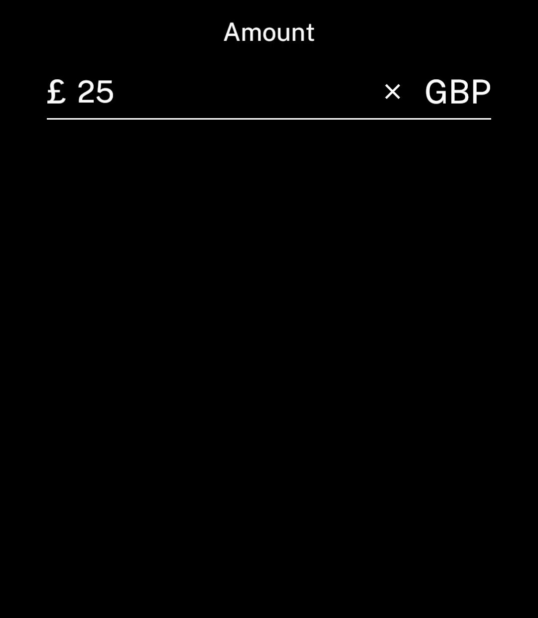
<p>Use <code>prefix</code> and <code>suffix</code> for fixed text. Neither is included in the value.</p>

```tsx
<TextInput
  value={value}
  onChange={setValue}
  placeholder="Amount"
  inputMode="numeric"
  action="done"
  prefix="£"
  suffix="GBP"
/>
```

</div>
<div className="pattern-preview">
<img src="/images/patterns/input-affixes.png" alt="Amount input showing £ before 25 and GBP after it, above the underline." width="1080" height="1240" />
</div>
</div>

## Hints and errors

<div className="pattern-example">
<div>

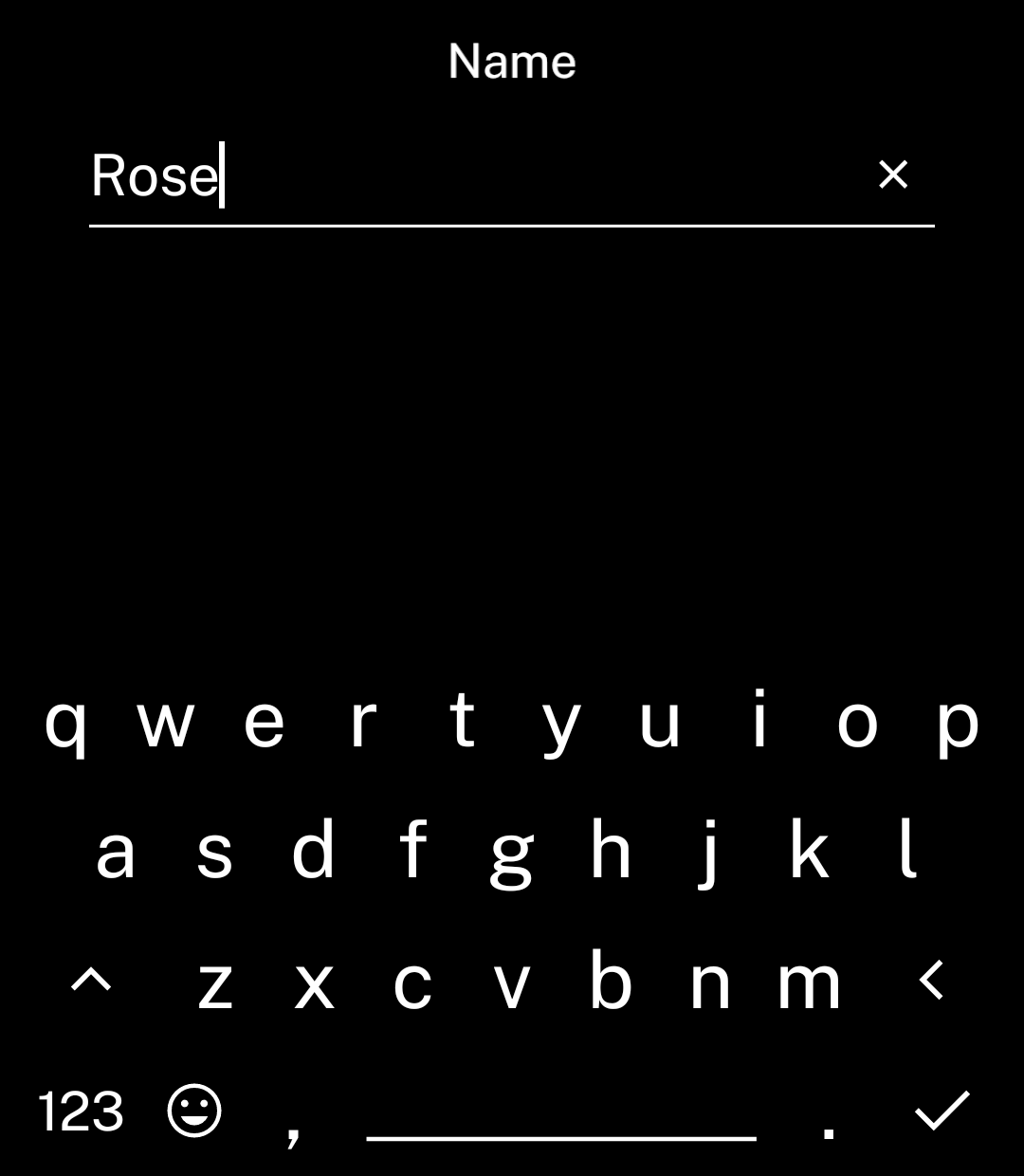
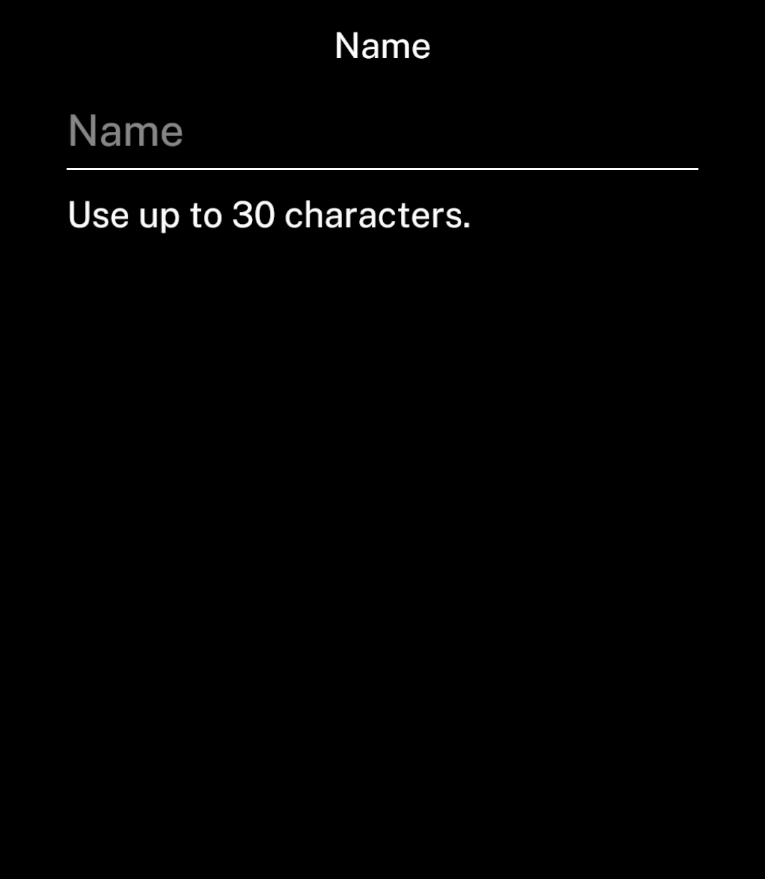
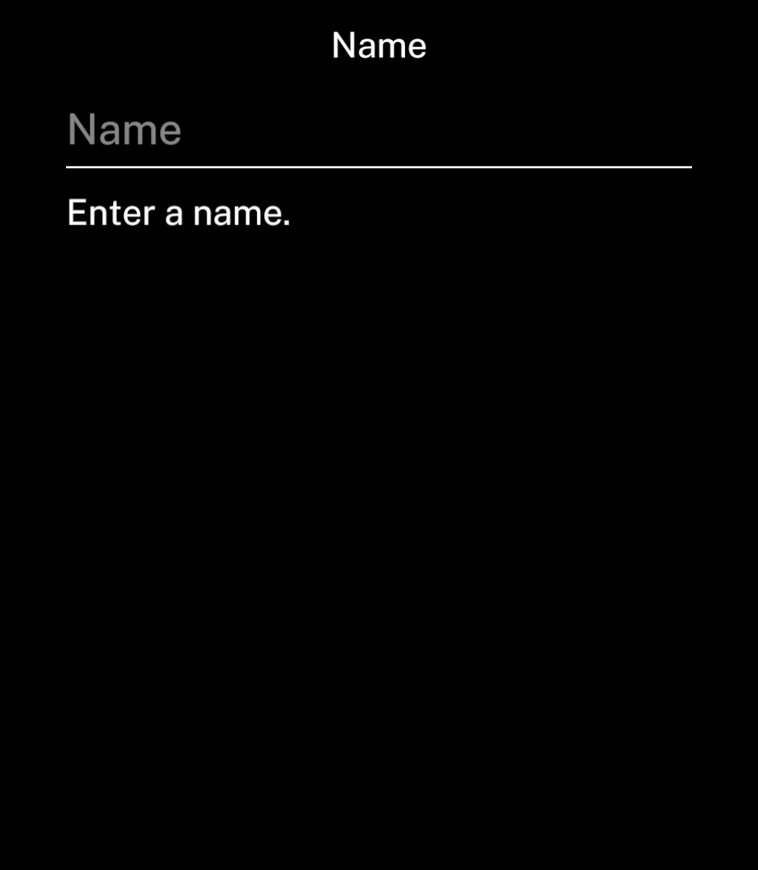
<p>Place a small <code>Text</code> component below the input.</p>

```tsx
<Stack gap={12}>
  <TextInput
    value={name}
    onChange={setName}
    placeholder="Name"
    action="done"
    onSubmit={value => setError(
      value.trim() ? "" : "Enter a name."
    )}
  />
  <Text size={20}>
    {error || "Use up to 30 characters."}
  </Text>
</Stack>
```

</div>
<div className="pattern-preview">
**Hint**

<img src="/images/patterns/input-hint.png" alt="Name input with a character limit hint underneath." width="1080" height="1240" />

**Error**

<img src="/images/patterns/input-error.png" alt="Name input with Enter a name underneath." width="1080" height="1240" />

</div>
</div>