---
title: "Toggles"
description: "Turn a setting on or off."
---

## Example

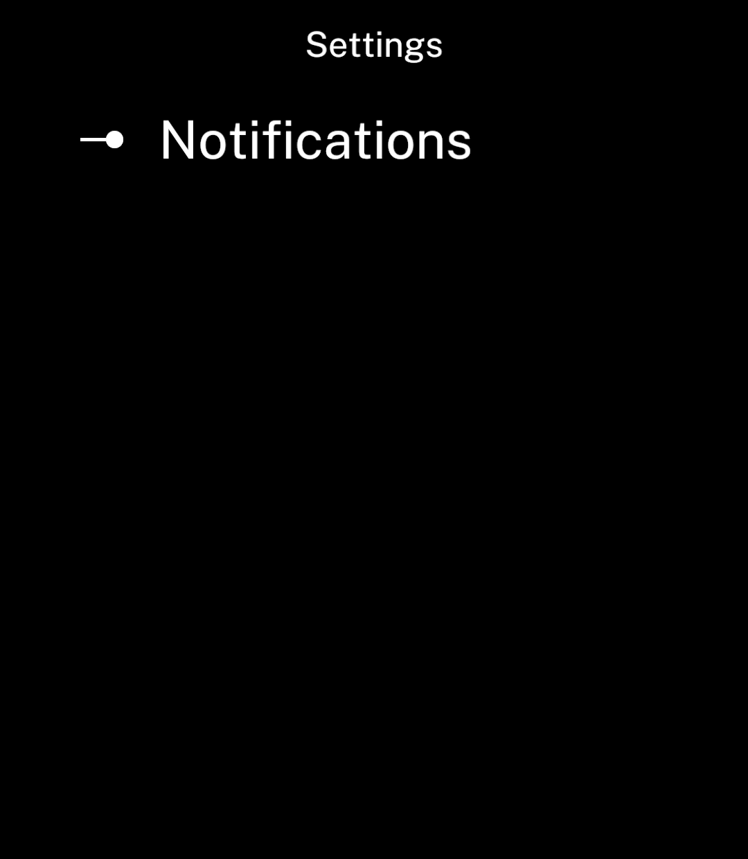
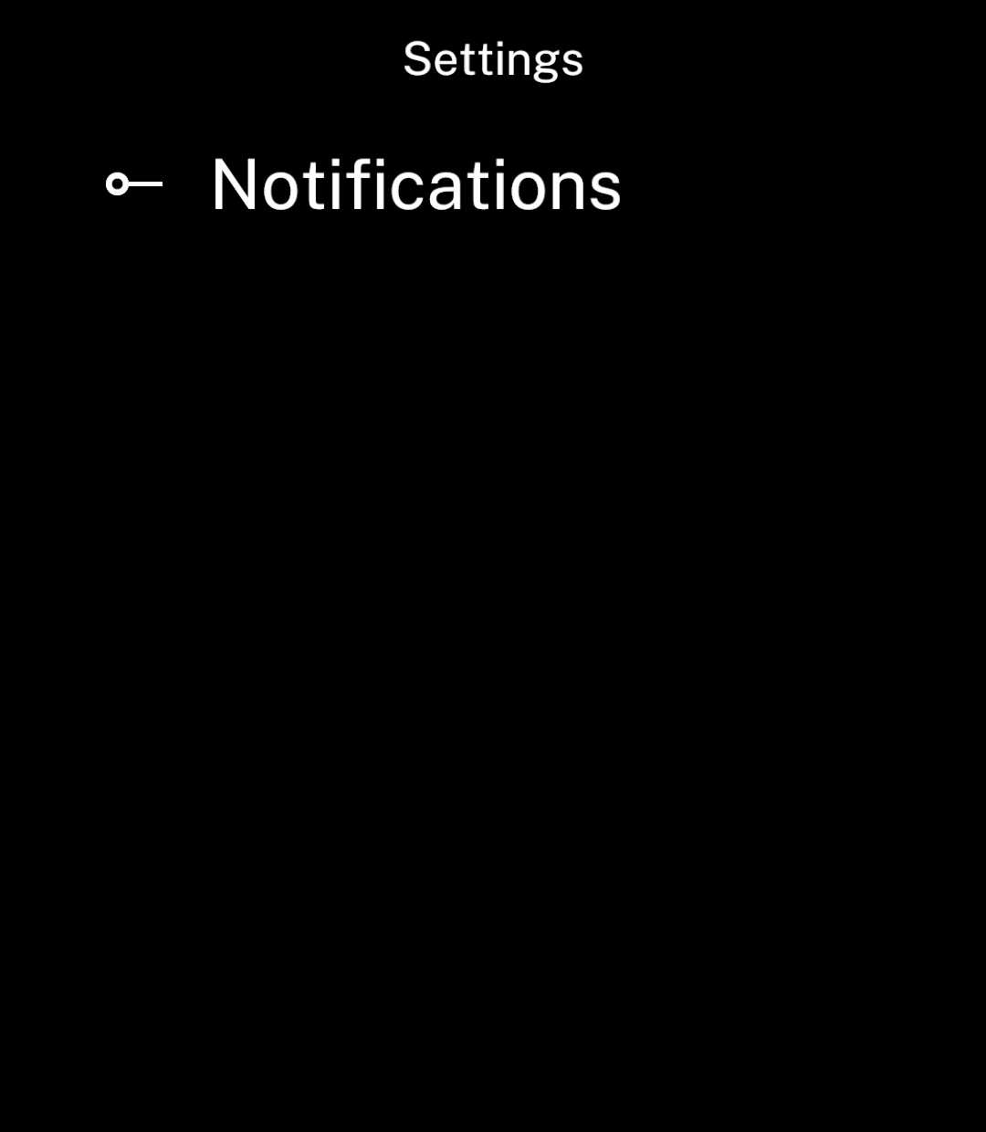
Long labels wrap. The switch stays centred beside the text.

<div className="pattern-example">
<div>

```tsx app/index.tsx
import { useState } from "react";
import { Screen, Toggle } from "ink";

export default function Settings() {
  const [enabled, setEnabled] = useState(true);

  return <Screen title="Settings">
    <Toggle
      label="Notifications"
      value={enabled}
      onChange={setEnabled}
    />
  </Screen>;
}
```

</div>
<div className="pattern-preview">
**On**

<img src="/images/patterns/toggle-on.png" alt="Notifications enabled." width="1080" height="1240" />

**Off**

<img src="/images/patterns/toggle-off.png" alt="Notifications disabled." width="1080" height="1240" />

</div>
</div>

## Disabled

<div className="pattern-example">
<div>

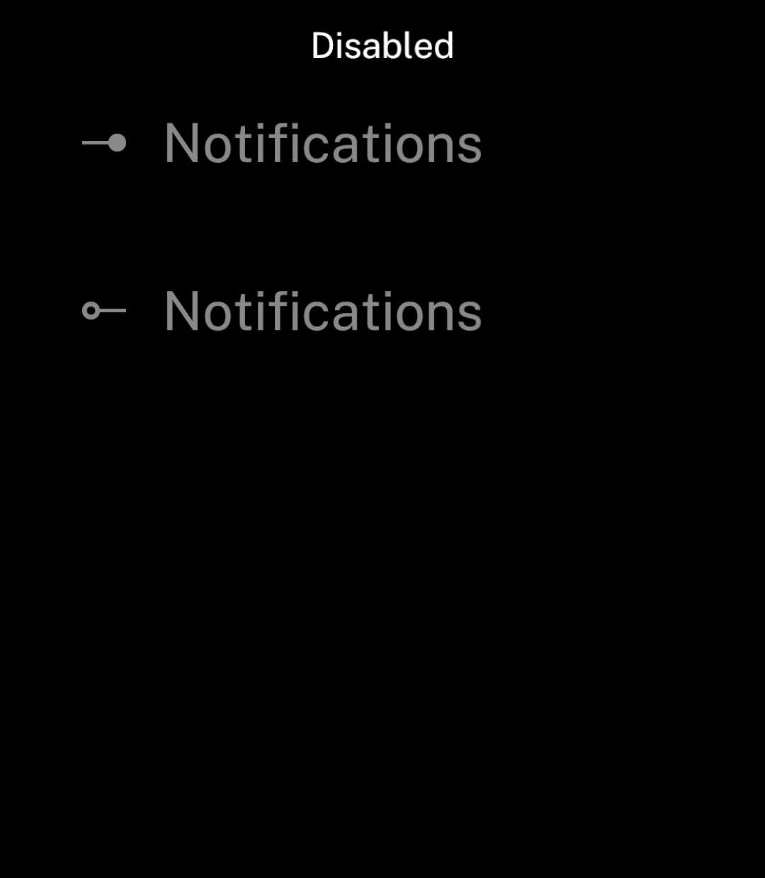
<p><code>disabled</code> prevents changes.</p>

```tsx
<Toggle label="Notifications" value={enabled}
  onChange={setEnabled} disabled />
```

</div>
<div className="pattern-preview">
<img src="/images/patterns/toggle-disabled.png" alt="Unavailable toggles in their on and off states." width="1080" height="1240" />
</div>
</div>

See [Store](/store) to keep the value between sessions.

## Subtitle

<div className="pattern-example">
<div>

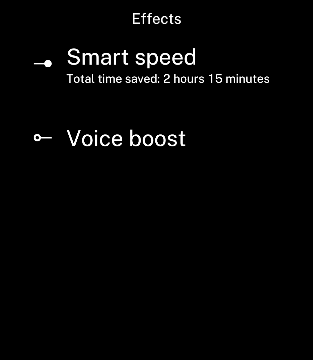
<p>Use <code>subtitle</code> for a smaller line beneath the label.</p>

```tsx
<Toggle label="Smart speed" subtitle="Total time saved: 2 hours 15 minutes"
  value={enabled} onChange={setEnabled} />
```

</div>
<div className="pattern-preview">
<img src="/images/patterns/toggle-subtitle.png" alt="Smart speed enabled with total time saved beneath the label." width="1080" height="1240" />
</div>
</div>