---
title: "Icons"
description: "Use Material icons or custom SVGs."
---

## Example

<div className="pattern-example">
<div>

```tsx app/index.tsx
import { Icon, Screen, Stack } from "ink";
import { home, homeFilled } from "ink/icons";

export default function Icons() {
  return <Screen title="Icons">
    <Stack axis="horizontal" gap={24}>
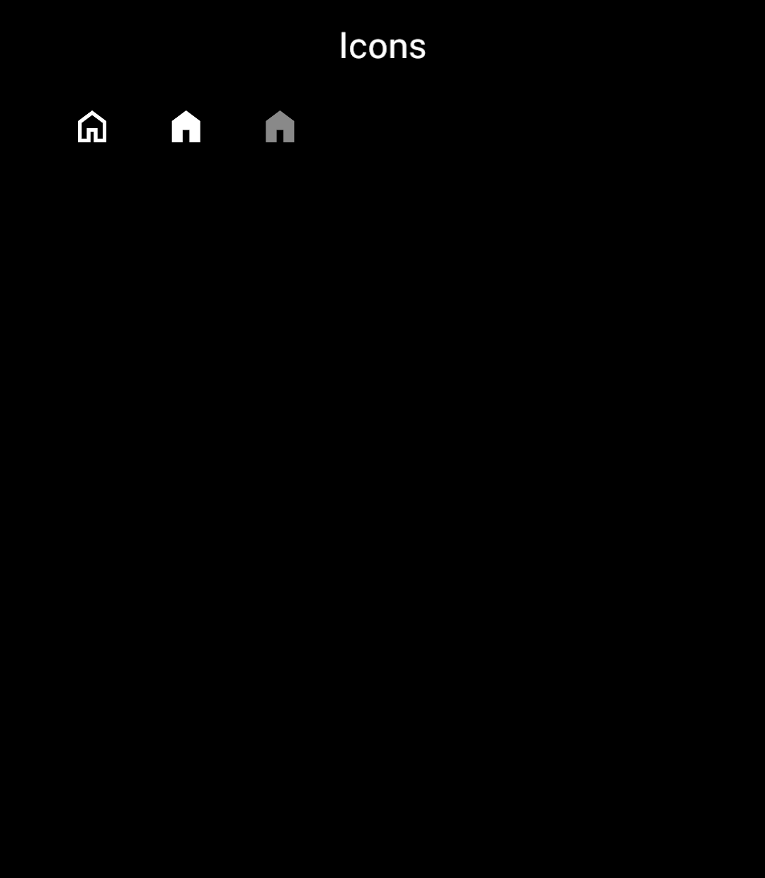
      <Icon name={home} />
      <Icon name={homeFilled} />
      <Icon name={homeFilled} tone="muted" />
    </Stack>
  </Screen>;
}
```

</div>
<div className="pattern-preview">
<img src="/images/patterns/icons.png" alt="Outlined, filled and muted home icons." width="1080" height="1240" />
</div>
</div>

## Size

<div className="pattern-example">
<div>

```tsx
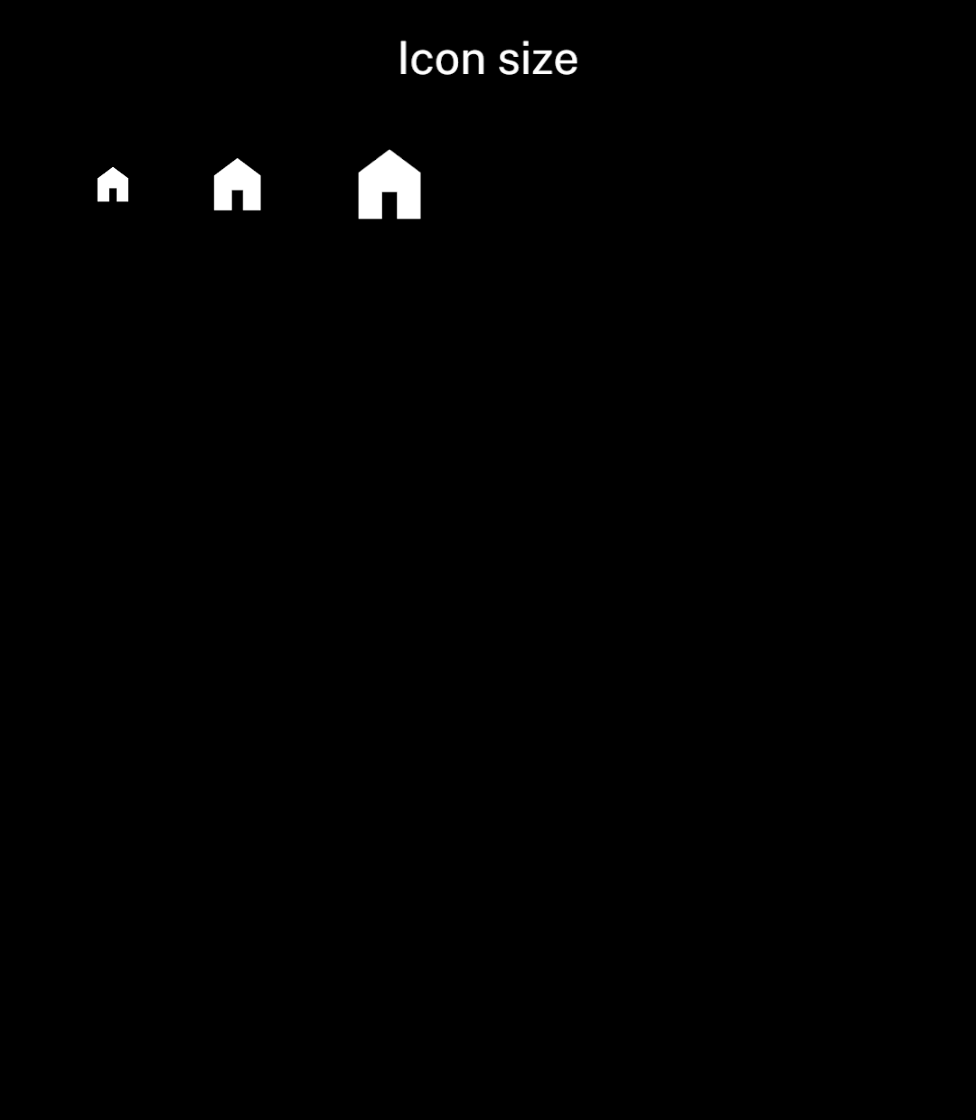
<Icon name={homeFilled} size={24} />
<Icon name={homeFilled} size={36} />
<Icon name={homeFilled} size={48} />
```

</div>
<div className="pattern-preview">
<img src="/images/patterns/icon-sizes.png" alt="Home icons at three sizes." width="1080" height="1240" />
</div>
</div>

Use the `Filled` suffix for filled icons. Release builds include only the variants you import. Use [Buttons](/buttons#icons) for tappable icons.

## Icon names

Find names in the [Material Symbols catalogue](https://fonts.google.com/icons). Convert snake case to camel case: `more_horiz` becomes `moreHoriz`. Names starting with a digit use an `icon` prefix, such as `icon360`; reserved names use an `Icon` suffix, such as `deleteIcon`. Your editor can suggest valid exports.

Use named imports. For dynamic lookups, pass a small object of imported icons to `findIcon(collection, name)`; it returns `undefined` for unknown names. A dynamic namespace import can bundle the whole catalogue.

Material icons use weight 400.

## Custom SVGs

<div className="pattern-example">
<div>

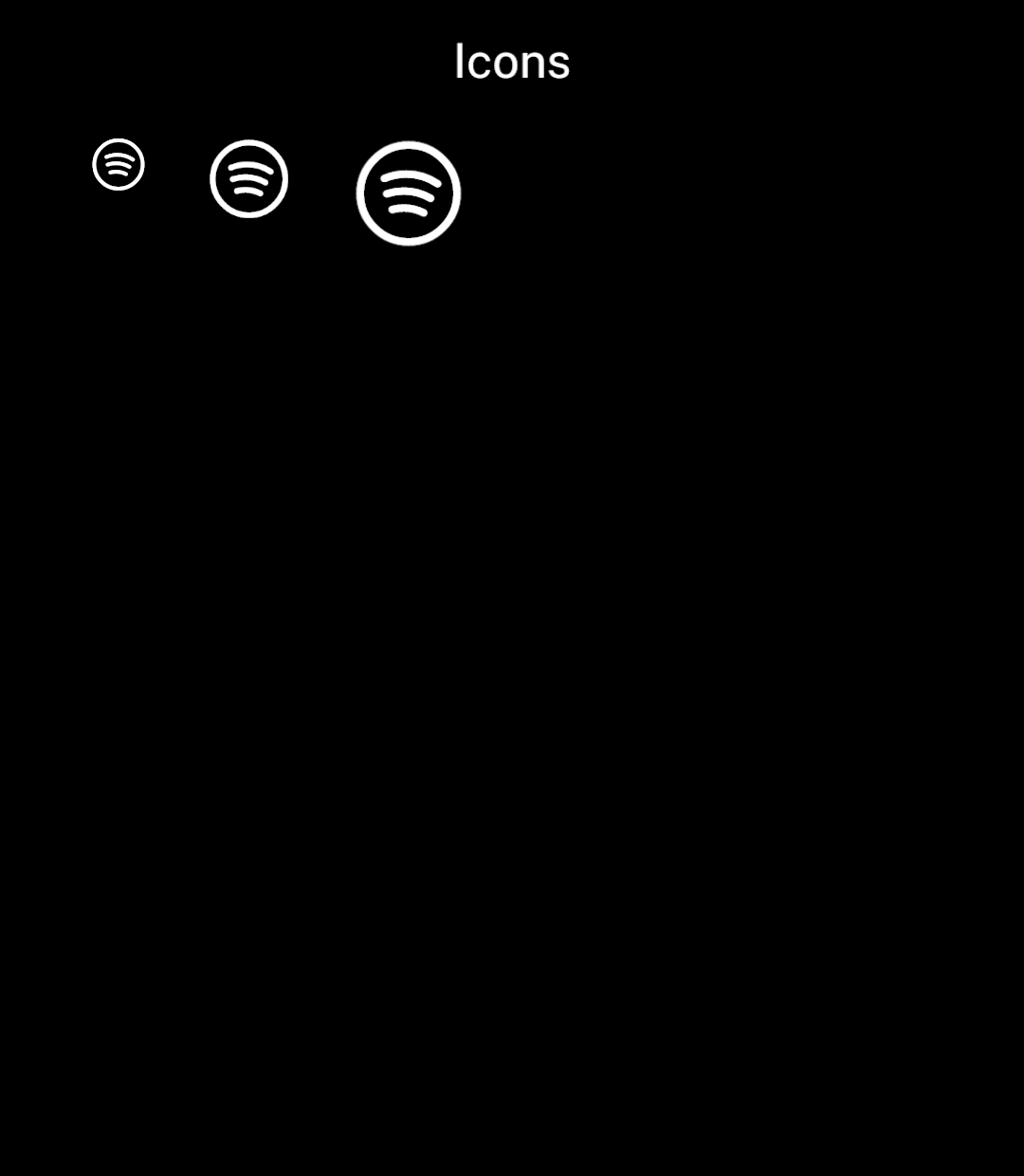
<p>Import an SVG wherever an icon is accepted. Here, the icon is <a href="https://hugeicons.com/icon/spotify?style=stroke-rounded">Spotify from Hugeicons</a>.</p>

```tsx
import { Icon, Stack } from "ink";
import spotify from "./assets/spotify.svg";

<Stack axis="horizontal" gap={24}>
  <Icon name={spotify} size={24} />
  <Icon name={spotify} size={36} />
  <Icon name={spotify} size={48} />
</Stack>
```

<p>SVG icons use the current text colour. Use a transparent background and paths rather than text or external images. Use <a href="/images">Image</a> for colour artwork.</p>

</div>
<div className="pattern-preview">
<img src="/images/patterns/icons-custom.png" alt="The Spotify icon at sizes 24, 36 and 48." width="1080" height="1240" />
</div>
</div>

## Bundling

Ink bundles only used icons as images. The APK does not include icon fonts or an SVG renderer.

An icon used at sizes 16, 24 and 48 needs only one image, sized for 48. If Ink cannot determine the size during the build, it uses at least 56. Enlarging an icon beyond its generated size can look blurry.