---
title: "Screens and layout"
description: "Arrange content, headers and tabs."
---

## Example

<div className="pattern-example">
<div>

```tsx
import { navigate, Screen, Text } from "ink";
import { moreHoriz } from "ink/icons";

export default function Home() {
  return <Screen
    title="Home"
    rightAction={{
      icon: moreHoriz,
      onPress: () => navigate("/actions"),
    }}
  >
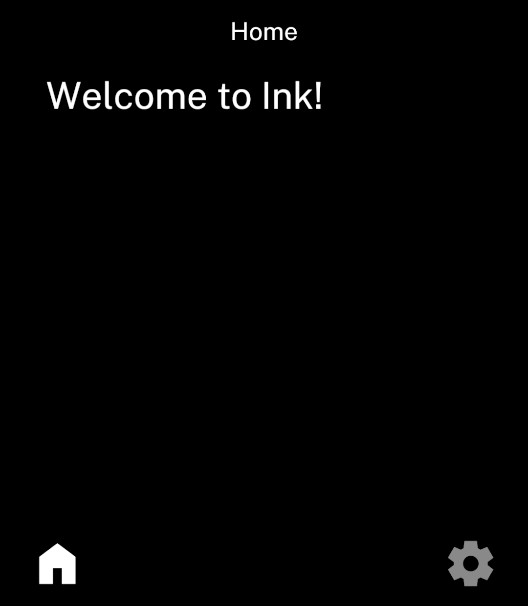
    <Text>Welcome to Ink!</Text>
  </Screen>;
}
```
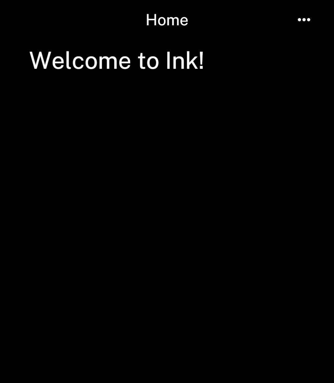
<p>Create <code>app/actions.tsx</code> for the header button’s destination. <code>Screen</code> provides padding, navigation and scrolling.</p>

</div>
<div className="pattern-preview">
<img src="/images/patterns/screen.png" alt="Home screen with a right header action." width="1080" height="1240" />
</div>
</div>

## Header actions

Use `leftAction` and `rightAction` for header buttons. Back takes precedence over `leftAction` on detail screens.

```tsx
import { Screen, navigate } from "ink";
import { graphicEq, sort } from "ink/icons";

<Screen
  title="Albums"
  leftAction={{ icon: sort, onPress: () => navigate("/albums-sort") }}
  rightAction={{ icon: graphicEq, onPress: () => navigate("/playing") }}
>
  {/* Screen content */}
</Screen>
```

## Centred content

<div className="pattern-example">
<div>

```tsx
<Screen title="Home" centered>
  <Text>Welcome to Ink!</Text>
</Screen>
```

</div>
<div className="pattern-preview">
<img src="/images/patterns/screen-centered.png" alt="Welcome to Ink! centred on the page." width="1080" height="1240" />
</div>
</div>

## Stacks

<div className="pattern-example">
<div>

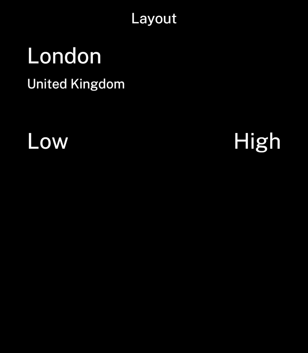
<p>Use <code>Stack</code> to group content. Set <code>axis="horizontal"</code> for a row.</p>
<p>Set <code>onPress</code> to make the whole group tappable, including gaps between its children. Use <code>haptic={false}</code> to disable feedback for that action.</p>

```tsx
<Stack gap={8}>
  <Text>London</Text>
  <Text size={18}>United Kingdom</Text>
</Stack>
<Stack axis="horizontal" justify="space-between">
  <Text>Low</Text>
  <Text>High</Text>
</Stack>
```

</div>
<div className="pattern-preview">
<img src="/images/patterns/stack.png" alt="A location grouped vertically above two horizontally spaced labels." width="1080" height="1240" />
</div>
</div>

## Space between

<div className="pattern-example">
<div>

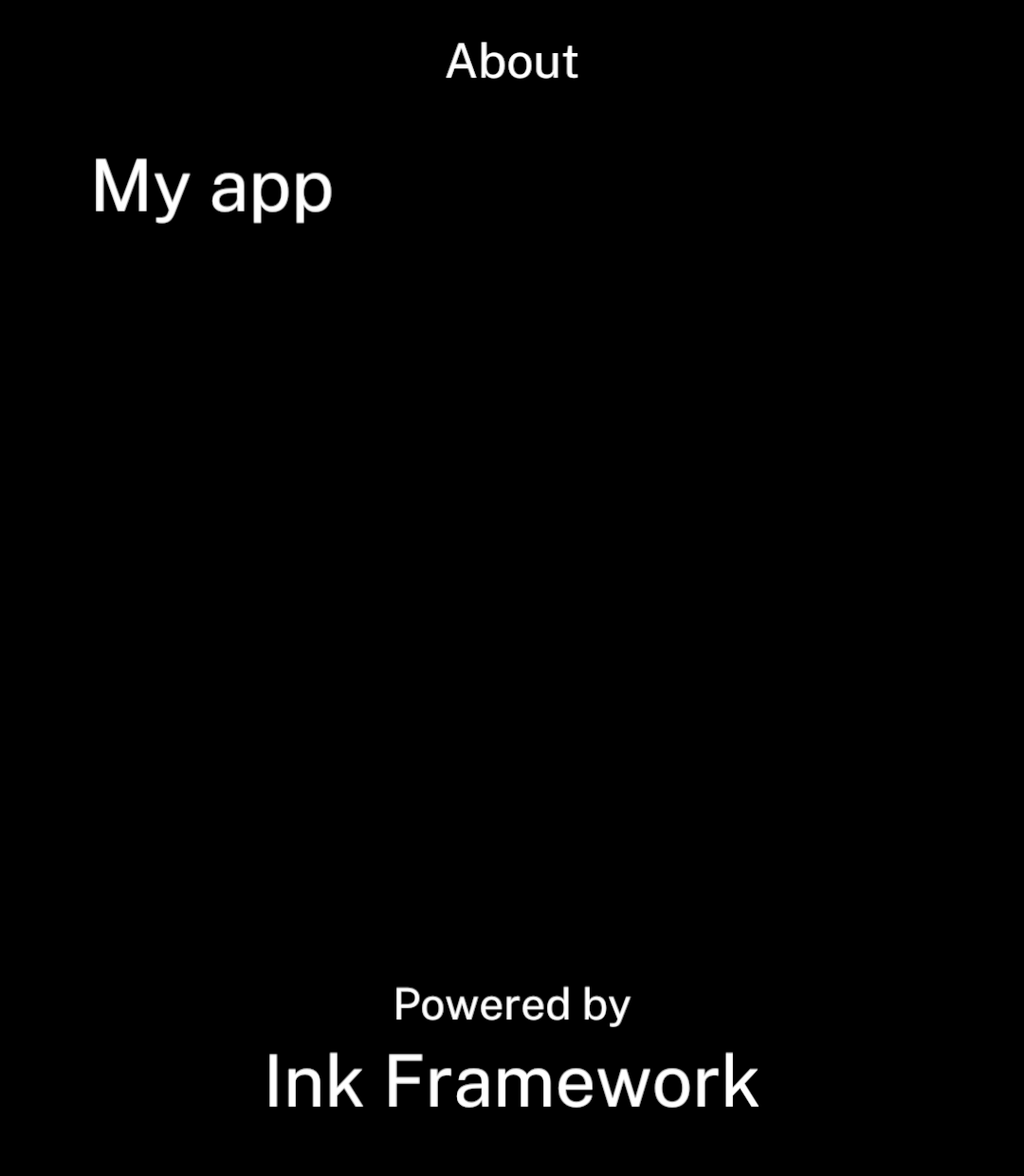
<p>A vertical <code>Stack</code> with <code>justify="space-between"</code> fills the content area when it is the only child of <code>Screen</code>.</p>

```tsx
import { Screen, Stack, Text } from "ink";

<Screen title="About">
  <Stack align="stretch" justify="space-between">
    <Text>My app</Text>
    <Stack align="center">
      <Text size={18}>Powered by</Text>
      <Text>Ink Framework</Text>
    </Stack>
  </Stack>
</Screen>
```

</div>
<div className="pattern-preview">
<img src="/images/patterns/stack-space-between.png" alt="My app at the top, with Powered by above Ink Framework centred at the bottom." width="1080" height="1240" />
</div>
</div>

## Pinned content

<div className="pattern-example">
<div>

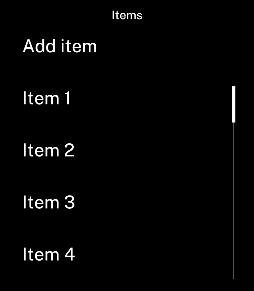
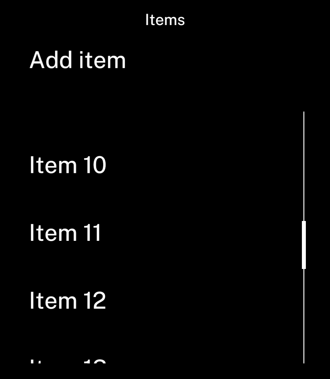
<p><code>header</code> keeps content above a scrolling list.</p>

```tsx
<Screen title="Items" header={<Button onPress={addItem}>Add item</Button>}>
  <List items={items} keyExtractor={item => item.id}
    renderItem={item => <Text>{item.name}</Text>} />
</Screen>
```

</div>
<div className="pattern-preview">
**Start**

<img src="/images/patterns/screen-header.png" alt="An Add item button above a list." width="1080" height="1240" />

**Scrolled**

<img src="/images/patterns/screen-header-scrolled.png" alt="The Add item button remains visible after scrolling." width="1080" height="1240" />

</div>
</div>

## Tabs

<div className="pattern-example">
<div>

<p>Declare tabs in <code>_layout.tsx</code>. Each name refers to a neighbouring page.</p>

```tsx app/(tabs)/_layout.tsx
import { Tabs } from "ink";
import { homeFilled, settingsFilled } from "ink/icons";

export default function Layout() {
  return <Tabs>
    <Tabs.Screen name="index" icon={homeFilled} />
    <Tabs.Screen name="settings" icon={settingsFilled} />
  </Tabs>;
}
```
<p>See <a href="/navigation#tabs">Navigation</a> for tab actions, page structure and history.</p>

</div>
<div className="pattern-preview">
<img src="/images/patterns/screen-tabs.png" alt="Home and settings icons in the bottom navigation bar." width="1080" height="1240" />
</div>
</div>

## Spacing and appearance

Screens and lists share a default gap of 47 logical units. `Stack` accepts `gap`, `align` and `justify`. Use `gap={0}` for compact groups; do not add padding around content already padded by the screen.

### Background

Set `background` to a `#RRGGBB` colour to fill the screen, including its header. Text keeps the current colour scheme. The background follows colour-scheme inversion, like Canvas colours.

```tsx
<Screen title="Railcard" background="#D35600">
  <Text>Card details</Text>
</Screen>
```

### Bottom spacing

<div className="pattern-example">
<div>

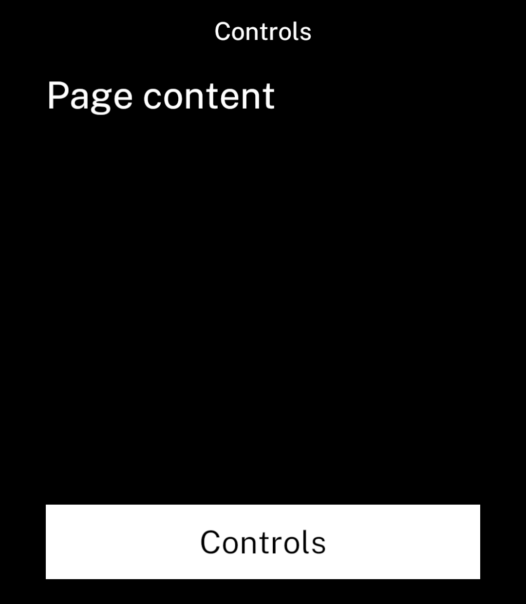
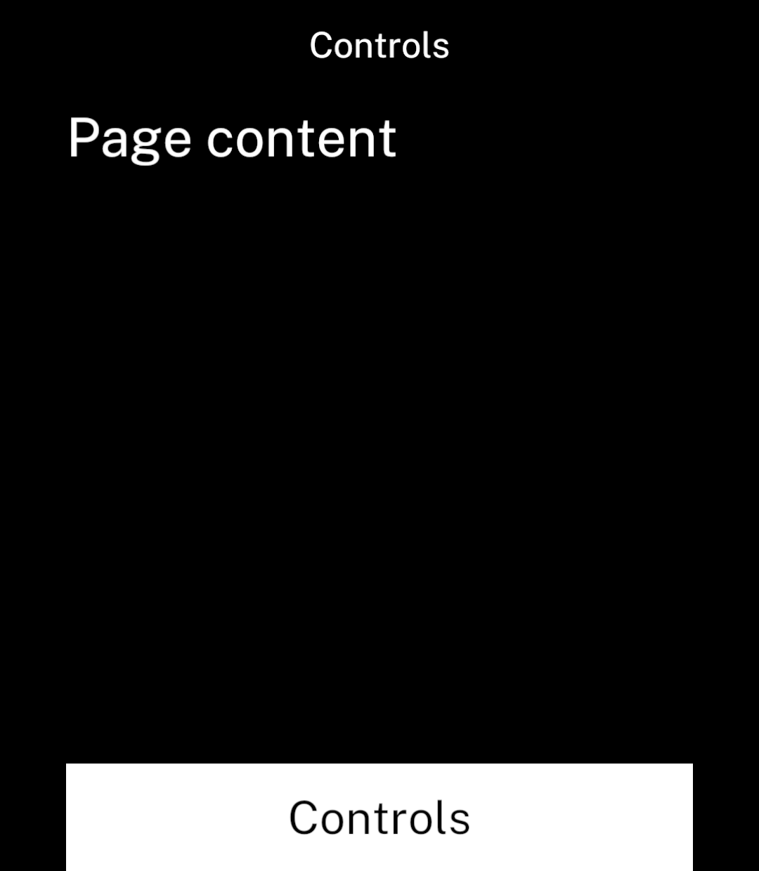
Set `bottomInset={false}` to let custom controls reach the bottom edge. The default leaves 20 logical units below the content.

```tsx
<Screen title="Controls" bottomInset={false}>
  <Stack justify="space-between" gap={0}>
    <Text>Page content</Text>
    <Canvas width={350} height={60}>
      <Rectangle x={0} y={0} width={350} height={60} fill="#FFFFFF" />
      <CanvasText x={0} y={0} width={350} height={60} colour="#000000">Controls</CanvasText>
    </Canvas>
  </Stack>
</Screen>
```

</div>
<div className="pattern-preview">
**Default**

<img src="/images/patterns/screen-bottom-inset.png" alt="Controls with the default space below them." width="1080" height="1240" />

**No bottom spacing**

<img src="/images/patterns/screen-no-bottom-inset.png" alt="The same controls reaching the bottom edge of the screen." width="1080" height="1240" />

</div>
</div>

### Colour scheme

Use a [toggle](/toggles) to switch between light and dark mode.

```tsx
import { Screen, Toggle, setColourScheme, useColourScheme } from "ink";

export default function Appearance() {
  const scheme = useColourScheme();

  return <Screen title="Appearance">
    <Toggle label="Light mode" value={scheme === "light"}
      onChange={light => setColourScheme(light ? "light" : "dark")} />
  </Screen>;
}
```

The choice lasts for the app session. Use [Store](/store) to save it between sessions. Photos and codes retain their original colours.

## Wide content

<div className="pattern-example">
<div>

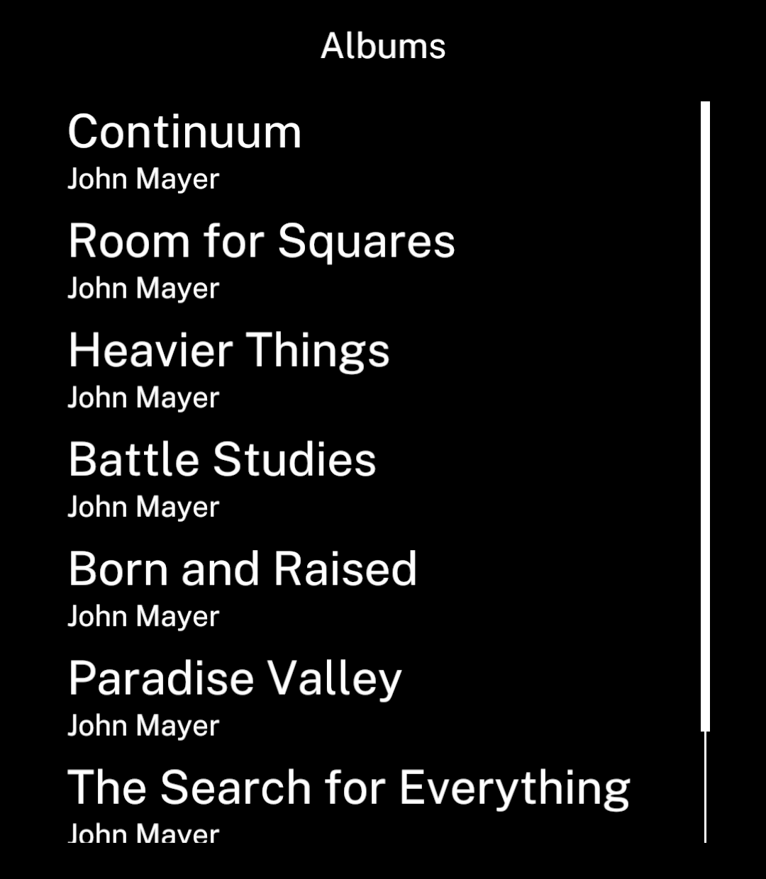
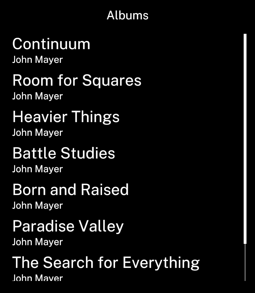
<p>Use <code>wide</code> to reduce horizontal margins to 20 units. Ink reserves space for the scrollbar when needed.</p>

```tsx
<Screen title="Albums" wide>
  <List items={albums} keyExtractor={album => album.id} renderItem={renderAlbum} />
</Screen>
```

</div>
<div className="pattern-preview">
**Normal**

<img src="/images/patterns/screen-normal.png" alt="Album list with normal content margins." width="1080" height="1240" />

**Wide**

<img src="/images/patterns/screen-wide.png" alt="The same album list with wider content and smaller margins." width="1080" height="1240" />

</div>
</div>

## Loading images

Screens wait up to one second for their first visible images before appearing. Failed images do not block the screen. Images reached by scrolling load normally.

To show content immediately:

```tsx
<Screen title="Show" waitForImages={false}>
  <Image src={show.artwork} width={100} height={100} fit="cover" />
  <Text>{show.title}</Text>
</Screen>
```