

Canvas
Draw rectangles, text and icons.
Use Canvas for boards, diagrams and other layouts with fixed coordinates.
Example
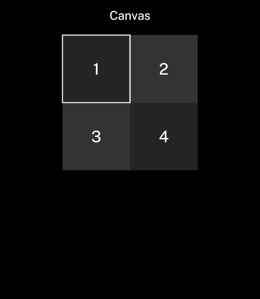
import { useState } from "react";
import { Canvas, CanvasText, Rectangle, Screen, Stack } from "ink";

export default function Example() {
  const [selected, setSelected] = useState(0);
  const cells = [0, 1, 2, 3];
  const bounds = (id: number) => ({
    x: 1 + id % 2 * 110, y: 1 + Math.floor(id / 2) * 110,
    width: 110, height: 110,
  });

  return <Screen title="Canvas">
    <Stack align="center">
      <Canvas width={222} height={222}>
        {cells.map(id => <Rectangle key={id} {...bounds(id)}
          fill={id % 3 === 0 ? "#242424" : "#333333"}
          onPress={() => setSelected(id)} />)}
        <Rectangle {...bounds(selected)} stroke="#DDDDDD" strokeWidth={2} />
        {cells.map(id => <CanvasText key={id} {...bounds(id)}>{id + 1}</CanvasText>)}
      </Canvas>
    </Stack>
  </Screen>;
}
Coordinates and outlines
Coordinates use Ink’s logical units, starting at the canvas’s top-left corner. The canvas scales down proportionally if it cannot fit. Drawing is clipped to its edges.
Rectangle accepts a fill, a stroke or both. Strokes sit centred on the rectangle’s boundary. Leave half the stroke width inside the canvas edge to keep the full outline visible.
import { Canvas, Rectangle } from "ink";

<Canvas width={202} height={102}>
  <Rectangle x={1} y={1} width={100} height={100} fill="#242424" />
  <Rectangle x={101} y={1} width={100} height={100} fill="#333333" />
  <Rectangle x={101} y={1} width={100} height={100}
    stroke="#DDDDDD" strokeWidth={2} />
</Canvas>
Colours use #RRGGBB values and follow the app’s colour scheme. Rectangles are drawn in order; text appears above them. Add onPress to a rectangle to make its area tappable.
Long press and drag
Add onLongPress to a tappable rectangle for a second action. With onDragEnter, holding and dragging calls the handler on each rectangle crossed in the same canvas. Releasing ends the drag without firing onPress.
<Rectangle x={0} y={0} width={40} height={40}
  fill="#242424"
  onPress={() => select(0)}
  onLongPress={() => beginSelection(0)}
  onDragEnter={() => extendSelection(0)} />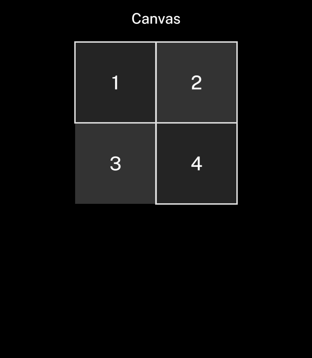
Text
CanvasText centres a single line within its bounds. Set align to start or end for horizontal alignment. Text outside its bounds is clipped.
Use tabularNumbers for equal-width digits in counters, timers and grids.
import { Canvas, CanvasText } from "ink";

<Canvas width={200} height={60}>
  <CanvasText x={0} y={0} width={200} height={60}
    size={26} colour="#BBBBBB" align="start">12</CanvasText>
</Canvas>
Canvas accepts Rectangle, CanvasText and CanvasIcon children. Use Stack and Text for layouts that need wrapping or automatic spacing.
Icons
CanvasIcon accepts the same icons as Icon. Set colour to contrast with a filled rectangle.
import { Canvas, CanvasIcon, Rectangle } from "ink";
import { editSquare } from "ink/icons";

<Canvas width={40} height={40}>
  <Rectangle x={0} y={0} width={40} height={40} fill="#FFFFFF" />
  <CanvasIcon x={6} y={6} size={28} name={editSquare} colour="#000000" />
</Canvas>