

Playing screen
Display artwork and playback controls.
Example
Pass your player as playback. The screen connects its native clock and transport commands.
Titles and artist names stay on one line and scroll when they don’t fit.
Progress and elapsed time update natively. The screen derives buffering and initial loading from the player, and keeps the pause icon visible while playback is requested.
import { PlayingScreen } from "ink";
import artwork from "../assets/wallsocket.jpg";

<PlayingScreen
  image={artwork}
  title="Cops and robbers"
  artists={[{ name: "underscores" }]}
  playback={player}
  actions={actions}
/>
Use a player from Audio. PlayingScreen provides the whole screen; do not wrap it in Screen.
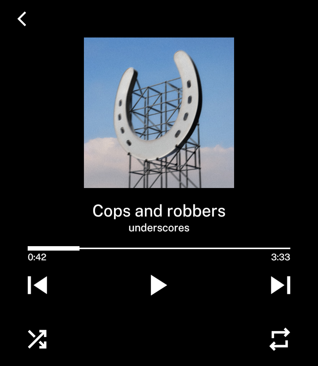
Native playback clock
PlayingScreen reads the native clock from its playback binding. Apps do not pass position, speed or seek handlers separately. See native playback progress.
Custom players implement the exported Playback interface: state, toggle() and seek(). Optional previous(), next() and seekBy() methods enable the corresponding buttons. Native clock bindings remain internal to Ink players. Custom players and controlled previews render their supplied state.
Transport commands and bottom actions may return promises. The screen prevents overlapping commands, shows failures and retries the command that failed. App-specific commands supplied in the binding still run, including persistence and sleep-timer logic.
Upcoming artwork
Pass up to two cover sources in preloadImages, such as the next and previous tracks. Ink prepares them at the playing screen’s image size and keeps the current cover visible while a replacement loads.
<PlayingScreen image={track.artwork} preloadImages={nearbyCovers} {...playbackProps} />Without artwork
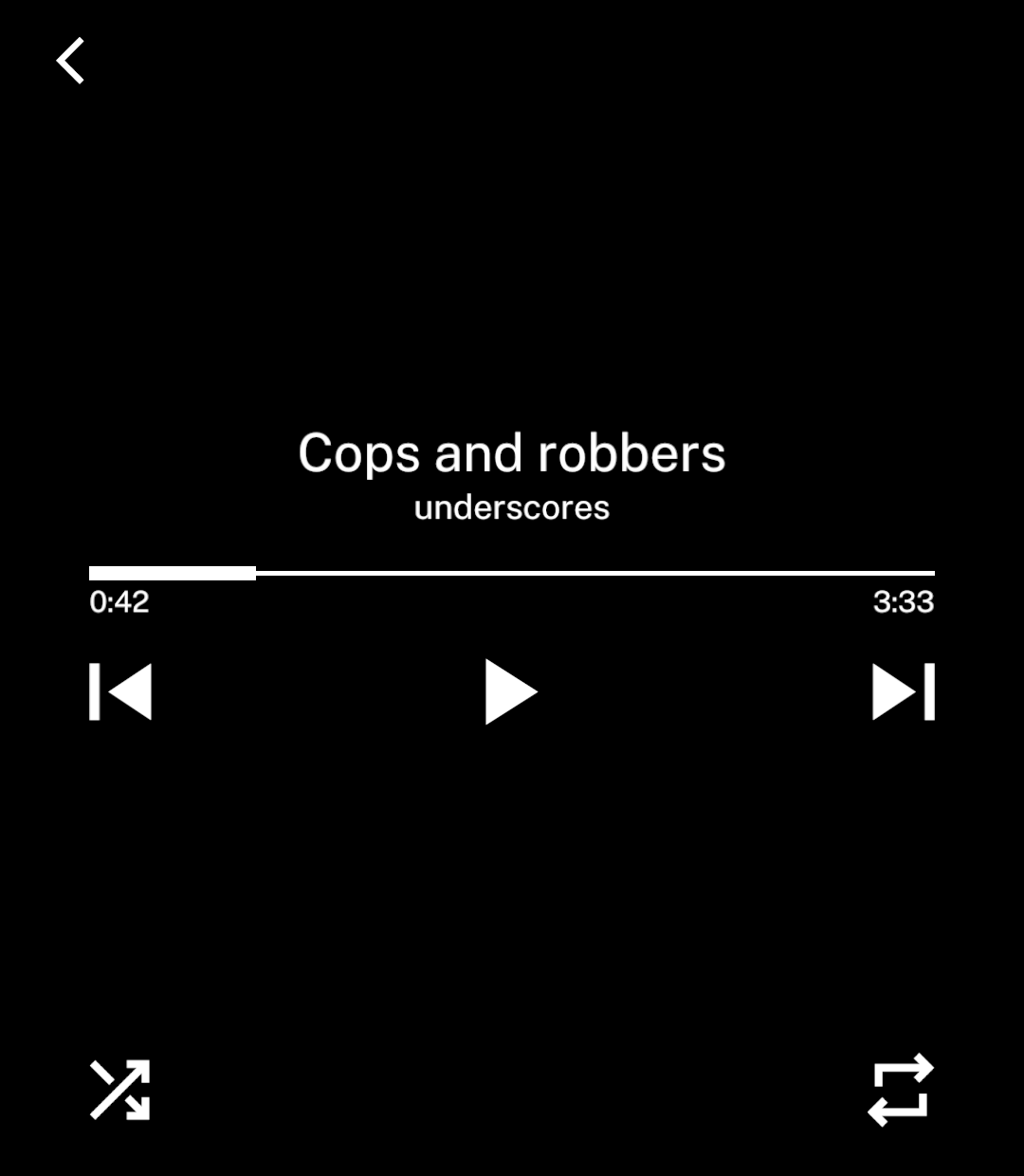
Omit image to centre the main controls.
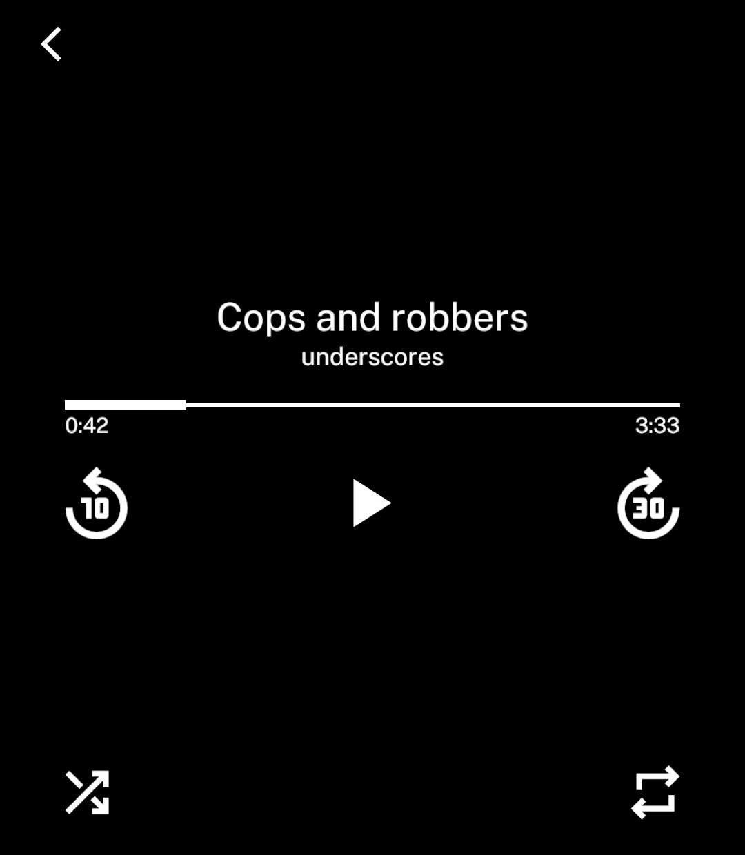
Seek buttons
Set kind: “skip” and seconds to 5, 10 or 30 to use relative seeking.
previous={{ kind: "skip", seconds: 10 }}
next={{ kind: "skip", seconds: 30 }}
onLongPress adds a separate long-press action. It runs once and suppresses the tap on release. disabled prevents both actions.
Bottom actions
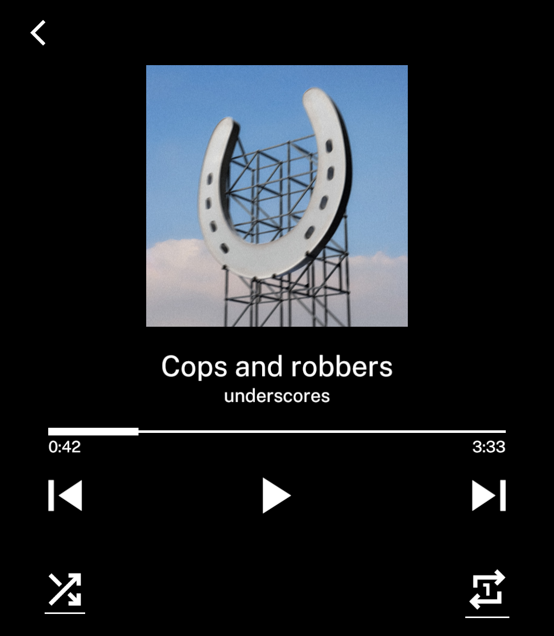
Actions are spaced evenly at the bottom. Use selected for an underline, or change the icon.
Use label instead of icon for text actions, such as playback speed or download progress. Numbers align automatically.
import { repeatFilled, repeatOneFilled, shuffleFilled } from "ink/icons";

const actions = [
  { icon: shuffleFilled, selected: shuffled, onPress: toggleShuffle },
  { icon: repeatOne ? repeatOneFilled : repeatFilled,
    selected: repeating, onPress: cycleRepeat },
];
Transport controls default to { kind: "track" }, which calls the matching previous() or next() method on playback. { kind: "skip", seconds: 10 } calls seekBy() with the matching direction and interval. Unavailable methods disable the control.
Use { kind: "custom", icon, onPress } for a custom transport action. Its icon and handler are explicit, so there is no default action to override. Every variant accepts onLongPress and disabled; long presses remain separate from taps.
Title and artists
Use onTitlePress for the track title and an onPress on each artist to open their pages. An image reserves its space while loading.